Tabbed Navigation with React Navigation in React Native
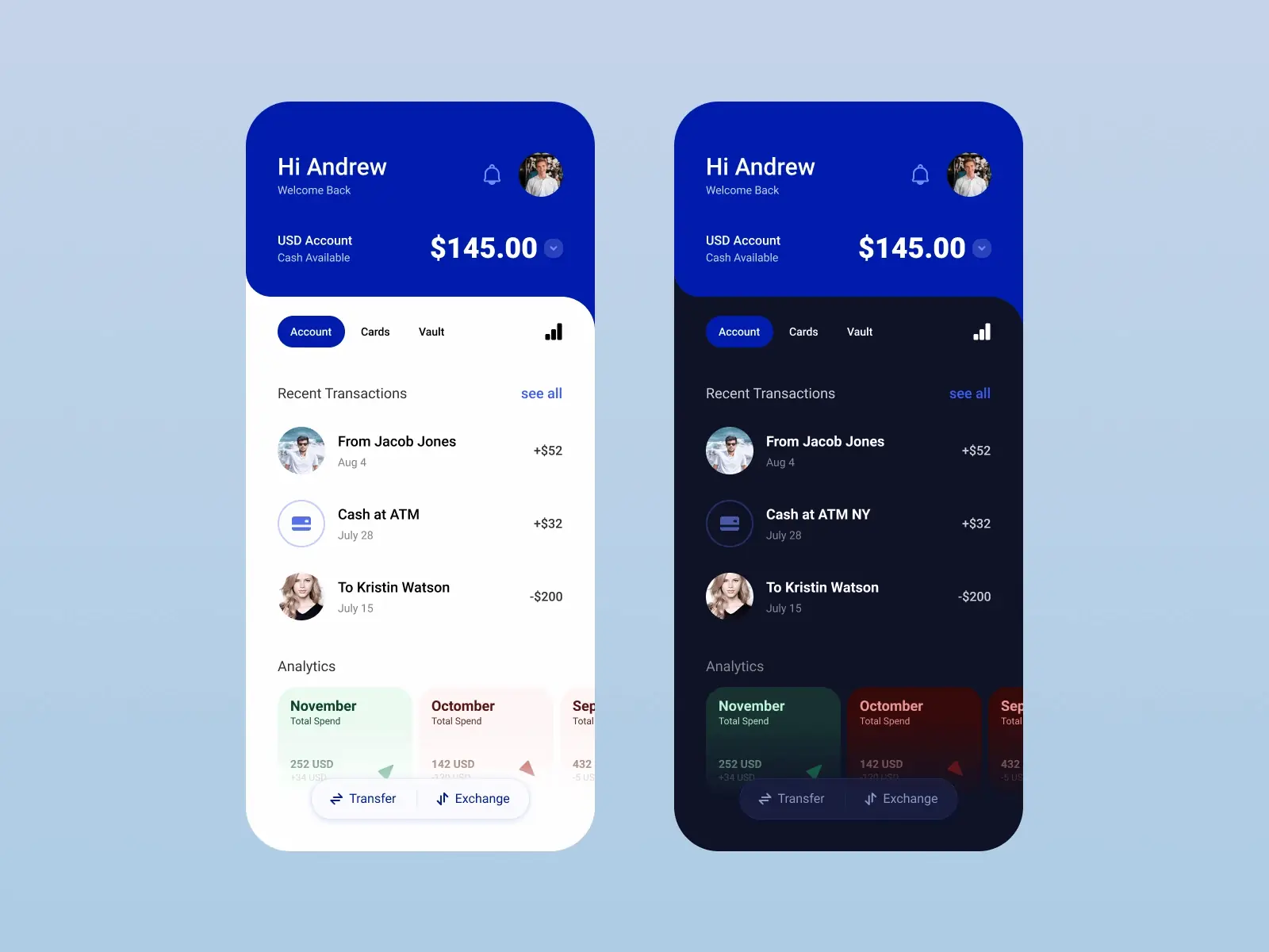
In this article, we are building Tabbed Navigation by creating a fictional Fintech Application Layout using React Native (Expo) and Styled Components. This was inspired from the Dribbble shot below by Emanuel Mateiuc. This article assumes some basic knowledge of React and CSS flexbox at the least, but a little documentation and you should be fine.
To get started we need to creat a new Expo project using the Expo CLI. To get the CLI you need to have NodeJs, Git and Watchman(for macOS users) installed according to the docs. When you have that installed, install the CLI, initilize a new Expo application with a blanck Typescript configuration and then cd into the directory and open in your IDE/code editor of choice (I use Visual Studio Code).
//install expo command line tools
npm install --global expo-cli

//initialize a new expo application
expo init fintech

//go to app directory
cd fintech

//open diretory in VScode
code .

//start project - usually open up my poject in the iOS simulator
expo start
If everything goes according to plan we should have plain Typscript Application running:
First off, strip off most of the code in App.tsx and leaving just an unstyled <View> tag. Then create the user header section, in root first create a components directory to hold all components. In components create another header directory and in there our js Header.tsx and header.styles.ts files to hold our header and the styles respectively. Now, js App.tsx should look just like this (an empty React Fragment):
import React from 'react';

export default function App() {
  return <></>;
}
Next we want to install styled-component and its types to help us add some styles as well as react-native-svg so we can directly use svg tags:
npm install --save styled-components @types/styled-components @types/styled-components-react-native react-native-svg
In Header.tsx:
import * as React from 'react';
import Svg, { Path } from 'react-native-svg';
import {
  TopRegion,
  Row,
  Column,
  TextBold,
  TextNormal,
  TextSmall,
} from './Header.style';
import { Image, StyleSheet } from 'react-native';
import Layout from '../Layout';

const Header: React.FC = () => {
  return (
    <TopRegion>
      <Layout>
        <Row>
          <Column>
            <TextNormal>Hi, Samuel</TextNormal>
            <TextSmall>Welcome back</TextSmall>
          </Column>
          <Row>
            <Svg
              width={24}
              height={24}
              viewBox='0 0 24 24'
              fill='none'
              stroke='rgba(255,255,255, 0.8)'
              strokeWidth={2}
              strokeLinecap='round'
              strokeLinejoin='round'
              style={{ marginRight: 10 }}
            >
              <Path d='M18 8A6 6 0 006 8c0 7-3 9-3 9h18s-3-2-3-9M13.73 21a2 2 0 01-3.46 0' />
            </Svg>
            <Image
              source={{
                uri: 'https://res.cloudinary.com/cortehz/image/upload/v1623664852/IMG_7422_ij5qgj.jpg',
              }}
              style={styles.image}
            />
          </Row>
        </Row>
        <Row>
          <Column>
            <TextNormal>USD Account</TextNormal>
            <TextSmall>Cash Available</TextSmall>
          </Column>

          <Row>
            <TextBold>$145.00</TextBold>
            <Svg
              style={{ marginLeft: 10 }}
              width='16'
              height='16'
              fill='#364ec5'
              viewBox='0 0 16 16'
            >
              <Path d='M0 2a2 2 0 0 1 2-2h12a2 2 0 0 1 2 2v12a2 2 0 0 1-2 2H2a2 2 0 0 1-2-2V2zm4 4a.5.5 0 0 0-.374.832l4 4.5a.5.5 0 0 0 .748 0l4-4.5A.5.5 0 0 0 12 6H4z' />
            </Svg>
          </Row>
        </Row>
      </Layout>
    </TopRegion>
  );
};

export default Header;

const styles = StyleSheet.create({
  image: {
    height: 60,
    width: 60,
    borderRadius: 50,
  },
});
Here we have some styled components put together, the top region being responsible for the blue top area. Everything in the region is wrapped by a Layout component that we'll create, its just a view with paddings on that takes children. Next we have two Rows each having items that are Columns and Rows respectively and with a style of property of space-between to put them on opposite sides. We have also used react-native-svg to directly use svgs in out views. Next in Header.style.ts we actually create does components with styled components and export them.
In Header.styles.ts:
import styled from 'styled-components/native';

// user top region container
export const TopRegion = styled.View`
  background-color: #001cad;
  border-bottom-left-radius: 30px;
  padding-top: 55px;
  padding-bottom: 40px;
`;

// row styles, each row has items(Views) with space inbetween
export const Row = styled.View`
  flex-direction: row;
  justify-content: space-between;
  align-items: center;
`;

// column styles
export const Column = styled.View`
  display: flex;
  flex-direction: column;
  margin-top: 25px;
`;

//text styles
export const TextNormal = styled.Text`
  font-size: 18px;
  color: #fff;
`;

export const TextSmall = styled.Text`
  font-size: 12px;
  color: rgba(255, 255, 255, 0.8);
`;

export const TextBold = styled.Text`
  font-size: 24px;
  font-weight: 700;
  color: #fff;
`;
We have also added some styles for the varios Texts with Bold, Small and Normal. Next, create a Layout.tsx file directly in the components directory. Once again, it gives some padding to the sides of components inside of it - so its children.
In Layout.tsx:
import * as React from 'react';
import { View, StyleSheet } from 'react-native';

const Layout: React.FC = ({ children }) => {
  return <View style={styles.container}>{children}</View>;
};

export default Layout;

const styles = StyleSheet.create({
  container: {
    paddingRight: 20,
    paddingLeft: 20,
  },
});
Next, import Header in App.tsx also creating a new App.style.ts where styles for this file will live. They should both look like this:
In App.tsx:
import React from 'react';
import { MainContainer } from './App.style';
import Header from './components/header/Header';

export default function App() {
  return (
    <MainContainer>
      <Header />
    </MainContainer>
  );
}
In the styles we have a new styled-component called MainContainer which is also just a View.
in App.style.ts:
import styled from 'styled-components/native';

export const MainContainer = styled.View`
  flex: 1;
  flex-direction: column;
  position: relative;
`;
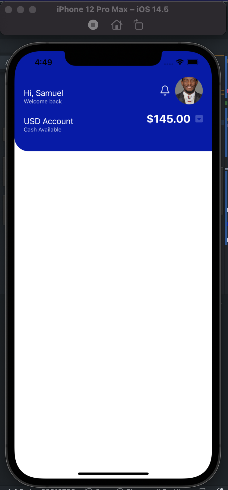
Right now, we should have our App looking real pretty and with some progress:
Right underneath the Header we want the Next View tag to have border-right-radius as well just like in the designs with the S-shape. That leaves a border-radius as needed but leaves a white background. To fix this, we'll add an absolute positioned empty _View that will take the same blue color as our header and fix it to the right side where the border lives to achieve that S-shape.
Import new styles and then right below <Header/> in App.tsx:
import { MainContainer, MainContent, FixedRight, Scroll } from "./App.style";
...

    <MainContent>
        <FixedRight></FixedRight>
        <Scroll></Scroll>
      </MainContent>

...
In App.style.ts :
...

export const MainContent = styled.View`
  position: relative;
`;

//box positioned to the top right of MainContent
export const FixedRight = styled.View`
  background-color: #001cad;
  position: absolute;
  right: 0;
  height: 40px;
  width: 40px;
`;

export const Scroll = styled.ScrollView`
  background-color: #fff;
  border-top-right-radius: 30px;
  padding: 30px;
`;
We are going to create a tabbed navigation next with react-navigation. To do this we have to install it and all its dependencies:
npm install @react-navigation/native

expo install react-native-gesture-handler react-native-reanimated react-native-screens react-native-safe-area-context @react-native-community/masked-view

npm install @react-navigation/material-top-tabs react-native-tab-view@^2.16.0
Inside scroll we want to have our top tab navigation. To do that we will inport NavigationContainer which as stated is the container to all our navigation items, we also want a DefaultTheme which gives us the ability to style this container. We also want a top bar so we are importing the createMaterialTopTabNavigator also from react-navigation.
In App.tsx
...

import { NavigationContainer, DefaultTheme } from "@react-navigation/native";
import { createMaterialTopTabNavigator, MaterialTopTabBarProps } from "@react-navigation/material-top-tabs";


//create a new theme that will be passed to the navigation
//use the default them color by spreading the property but change background to transparent
const MyTheme = {
  ...DefaultTheme,
  colors: {
    ...DefaultTheme.colors,
    background: "transparent",
  },
}

//Renders tab view which lets the user switch between several screens using swipe gesture or the tab bar. - docs
const Tab = createMaterialTopTabNavigator();

export default function App() {
...

<Scroll>
          <NavigationContainer theme={MyTheme}>
            <Tab.Navigator
              tabBar={(props: MaterialTopTabBarProps) => <TabsTop {...props} />}
            >
              <Tab.Screen name="Accounts" component={Accounts} />
              <Tab.Screen name="Cards" component={Cards} />
              <Tab.Screen name="Vault" component={Vault} />
            </Tab.Navigator>
          </NavigationContainer>
</Scroll>

...
Here we want the NavigationContainer to the MyTheme above. We are then using (render props)[https://reactjs.org/docs/render-props.html] to pass all the properties and declaring its type (MaterialTopTabBarProps) on the tabBar to the TabsTops component which will we create soon. Inside we have three screens which are components for specifying route configurations, each with a name and pointing to the component for that specific route. Next we create four (4) of the missing component: TabsTop, Accounts, Cards, Vault.
First off, TabsTop.tsx:
import React, { useState } from 'react';
import { View, StyleSheet, Text, TouchableOpacity } from 'react-native';
import Svg, { Path } from 'react-native-svg';
import { MaterialTopTabBarProps } from '@react-navigation/material-top-tabs';
import Layout from './Layout';
import { Row } from './header/Header.style';

const TabsTop: React.FC<MaterialTopTabBarProps> = ({
  state,
  descriptors,
  navigation,
}) => {
  return (
    <Layout>
      <Row>
        <Row style={{ flex: 4 }}>
          {state.routes.map((route, index) => {
            const { options } = descriptors[route.key];
            const label =
              options.tabBarLabel !== undefined
                ? options.tabBarLabel
                : options.title !== undefined
                ? options.title
                : route.name;

            const isFocused = state.index === index;

            const onPress = () => {
              const event = navigation.emit({
                type: 'tabPress',
                target: route.key,
                canPreventDefault: true,
              });

              if (!isFocused && !event.defaultPrevented) {
                navigation.navigate(route.name);
              }
            };

            const bg = (focus: boolean) => {
              if (focus) {
                return '#001cad';
              } else {
                return 'transparent';
              }
            };

            return (
              <TouchableOpacity
                key={index}
                accessibilityRole='button'
                accessibilityState={isFocused ? { selected: true } : {}}
                accessibilityLabel={options.tabBarAccessibilityLabel}
                testID={options.tabBarTestID}
                onPress={onPress}
                style={{
                  flex: 1,
                  padding: 10,
                  margin: 10,
                  borderRadius: 25,
                  marginRight: 10,
                  backgroundColor: bg(isFocused),
                }}
              >
                <Text
                  style={{
                    color: isFocused ? 'white' : '#222',
                    textAlign: 'center',
                  }}
                >
                  {label}
                </Text>
              </TouchableOpacity>
            );
          })}
        </Row>
        <View
          style={{
            flex: 1,
            alignItems: 'flex-end',
          }}
        >
          <Svg
            width={24}
            height={24}
            viewBox='0 0 24 24'
            fill='none'
            stroke='currentColor'
            strokeWidth={2}
            strokeLinecap='round'
            strokeLinejoin='round'
          >
            <Path d='M12 20V10M18 20V4M6 20v-4' />
          </Svg>
        </View>
      </Row>
    </Layout>
  );
};

export default TabsTop;
This component renders our tab items, taking props passed down from App.tsx earlier. State, descriptors, navigation. Right off the docs:
State: The navigation state for the navigator. The component can take this state and decide how to render it.
Navigation: The navigation object containing various helper methods for the navigator to manipulate the navigation state. This isn't the same as the navigation object for the screen and includes some helpers such as emit to emit events to the screens.
Descriptors: This is an object containing descriptors for each route with the route keys as its properties. The descriptor for a route can be accessed by
We are then mapping over the items in state which contains each of the items in Tab.Screen from App.tsx. Returning a button for each item with TouchableOpacity, each item can receive a focus when clicked on setting it as the current selected. We also created a helper function that changes the background color of the current selected/focused button. Reusing Row in Header from earlier giving it an extra style with flex: 4 as we want the tabs to cover more space than the network svg on the right side. Also, switching the padding to a padding-top: 20px in App.style.ts for Scroll as we have reused Layout for spacing.
Next we actually need to create the components these routes point to, create Accounts, Cards, Vault in components directory. They can be just a <Text></Text> with a placeholder
Accounts.tsx:
import React from 'react';
import { Text, View } from 'react-native';

export interface AccountProps {}

const Accounts: React.FC<AccountProps> = () => {
  return (
    <View>
      <Text>account</Text>
    </View>
  );
};

export default Accounts;
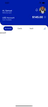
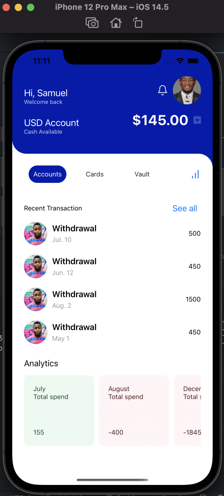
Replicating above for each of the routes, we should have a tabbed navigation working good:
REPLICATING ACCOUNTS SECTION FROM DESIGN
For Accounts we'll create two new components for the RecentTransaction and the Analytics with some fake hardcoded data.
In RecentTransaction.tsx:
import * as React from 'react';
import {
  View,
  Text,
  Button,
  NativeSyntheticEvent,
  NativeTouchEvent,
  StyleSheet,
  Image,
} from 'react-native';
import { Row } from '../header/Header.style';

interface Transaction {
  id: number;
  transactionCategory: string;
  transactionAmount: string;
  userProfile: string;
  transactionDate: string;
}

export const transcactionList = [
  {
    id: 0,
    transactionCategory: 'Withdrawal',
    transactionAmount: '500',
    userProfile:
      'https://images.unsplash.com/photo-1463453091185-61582044d556?ixid=MnwxMjA3fDB8MHxwaG90by1wYWdlfHx8fGVufDB8fHx8&ixlib=rb-1.2.1&auto=format&fit=crop&w=1350&q=80',
    transactionDate: 'Jul. 10',
  },

  {
    id: 1,
    transactionCategory: 'Withdrawal',
    transactionAmount: '450',
    userProfile:
      'https://images.unsplash.com/photo-1463453091185-61582044d556?ixid=MnwxMjA3fDB8MHxwaG90by1wYWdlfHx8fGVufDB8fHx8&ixlib=rb-1.2.1&auto=format&fit=crop&w=1350&q=80',
    transactionDate: 'Jun. 12',
  },
  {
    id: 2,
    transactionCategory: 'Withdrawal',
    transactionAmount: '1500',
    userProfile:
      'https://images.unsplash.com/photo-1463453091185-61582044d556?ixid=MnwxMjA3fDB8MHxwaG90by1wYWdlfHx8fGVufDB8fHx8&ixlib=rb-1.2.1&auto=format&fit=crop&w=1350&q=80',
    transactionDate: 'Aug. 2',
  },

  {
    id: 3,
    transactionCategory: 'Withdrawal',
    transactionAmount: '450',
    userProfile:
      'https://images.unsplash.com/photo-1463453091185-61582044d556?ixid=MnwxMjA3fDB8MHxwaG90by1wYWdlfHx8fGVufDB8fHx8&ixlib=rb-1.2.1&auto=format&fit=crop&w=1350&q=80',
    transactionDate: 'May 1',
  },
];

export interface RecentTransactionsProps {}

const RecentTransactions: React.FC<RecentTransactionsProps> = () => {
  return (
    <View style={{ marginTop: 25 }}>
      <Row>
        <Text>Recent Transaction</Text>
        <Button
          title='See all'
          onPress={(ev: NativeSyntheticEvent<NativeTouchEvent>) => {
            console.log(ev);
          }}
        />
      </Row>

      <View>
        {transcactionList.map((transaction: Transaction, idx) => {
          return (
            <Row key={idx}>
              <Row>
                <Image
                  source={{ uri: transaction.userProfile }}
                  style={styles.transactionImage}
                />
                <View>
                  <Text style={styles.textBold}>
                    {transaction.transactionCategory}
                  </Text>
                  <Text style={{ color: '#999', marginTop: 5 }}>
                    {transaction.transactionDate}
                  </Text>
                </View>
              </Row>

              <Text>{transaction.transactionAmount}</Text>
            </Row>
          );
        })}
      </View>
    </View>
  );
};

export default RecentTransactions;

const styles = StyleSheet.create({
  transactionImage: {
    width: 50,
    height: 50,
    borderRadius: 50,
    marginRight: 10,
    marginTop: 10,
    marginBottom: 10,
  },
  textBold: {
    fontWeight: '600',
    fontSize: 18,
  },
});
We have created a fake list of transactions which we map over and display while also re-using the Row from header to align the items. Next create an analytics component, also with some fake data.
In _Analytics.tsx:
import * as React from 'react';
import { ScrollView, View, Text } from 'react-native';
import styled from 'styled-components/native';

interface Spent {
  spent: number;
}

const Txt = styled.Text<Spent>`
  color: ${(props) => (props.spent < 0 ? '#501e1d' : '#1d4932')};
`;

const Card = styled.View<Spent>`
  justify-content: space-between;
  background-color: ${(props) => (props.spent < 0 ? '#fff4f6' : '#ebfaf0')};
  padding: 20px;
  border-radius: 10px;
  min-width: 150px;
  height: 150px;
  margin-right: 10px;
`;

const data = [
  {
    id: 0,
    month: 'July',
    incoming: 555,
    outgoing: 400,
  },

  {
    id: 1,
    month: 'August',
    incoming: 1000,
    outgoing: 1400,
  },
  {
    id: 2,
    month: 'December',
    incoming: 1555,
    outgoing: 3400,
  },
  {
    id: 3,
    month: 'December',
    incoming: 1555,
    outgoing: 3400,
  },
  {
    id: 4,
    month: 'December',
    incoming: 1555,
    outgoing: 3400,
  },
];

const totalSpend = (incoming: number, outgoing: number) => {
  return incoming - outgoing;
};

const Analytics: React.FC = () => {
  return (
    <>
      <Text style={{ marginTop: 20, marginBottom: 15, fontSize: 18 }}>
        Analytics
      </Text>
      <ScrollView horizontal={true}>
        {data.map(({ incoming, id, month, outgoing }) => {
          return (
            <Card spent={totalSpend(incoming, outgoing)} key={id}>
              <View>
                <Txt spent={totalSpend(incoming, outgoing)}>{month}</Txt>
                <Txt spent={totalSpend(incoming, outgoing)}>Total spend</Txt>
              </View>

              <Txt spent={totalSpend(incoming, outgoing)}>
                {totalSpend(incoming, outgoing)}
              </Txt>
            </Card>
          );
        })}
      </ScrollView>
    </>
  );
};

export default Analytics;
Analytics is a horizontal scroll view of the mapped fake data, we are also setting the color and background color of each card to be red or green depending on net spend for that month. We have a helper function that returns the net sum of transactions, and in out Text we are passing the returned value as props to the styled component which then sets the color depending on the returned value. Finally import both components in Accounts:
import React from 'react';
import Layout from '../Layout';
import Analytics from './Analytics';
import RecentTransactions from './RecentTransaction';

export interface AccountProps {}

const Accounts: React.FC<AccountProps> = () => {
  return (
    <Layout>
      <RecentTransactions />
      <Analytics />
    </Layout>
  );
};

export default Accounts;
Our results:
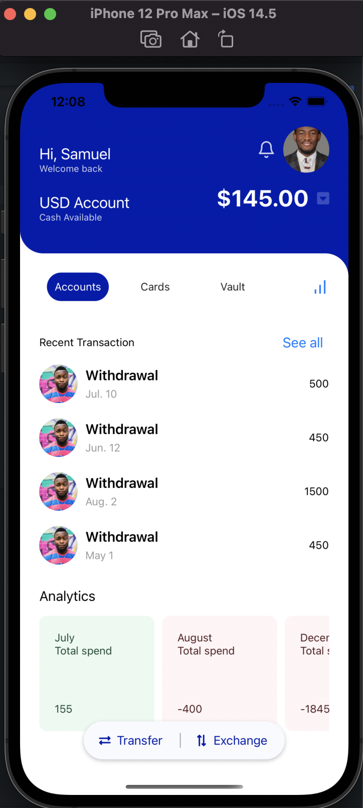
Finally in App.tsx, we have to create the last bit: The buttons fixed to the bottom of the screen. I am calling it QuickAccessButtons:
import * as React from 'react';
import { View, Text, TouchableWithoutFeedback } from 'react-native';
import styled from 'styled-components/native';
import Svg, { Path } from 'react-native-svg';
import { Row } from '../components/header/Header.style';

const TextStyled = styled.Text`
  font-size: 16px;
  padding-right: 12px;
  padding-left: 8px;
  color: #001cad;
`;

const QuickAccessButtons: React.FC = () => {
  return (
    <View
      style={{
        position: 'absolute',
        bottom: '5%',
        flexDirection: 'row',
        alignSelf: 'center',
        padding: 5,
        paddingRight: 10,
        paddingLeft: 10,
        backgroundColor: '#f9fafe',
        borderRadius: 50,
        shadowColor: '#000',
        shadowOffset: {
          width: 0,
          height: 2,
        },
        shadowOpacity: 0.23,
        shadowRadius: 2.62,

        elevation: 4,
      }}
    >
      <TouchableWithoutFeedback onPress={() => {}}>
        <Row
          style={{
            borderRightWidth: 1,
            borderColor: '#999',
            margin: 10,
          }}
        >
          <Svg
            aria-hidden='true'
            data-prefix='fas'
            data-icon='exchange-alt'
            viewBox='0 0 512 512'
            width={15}
            height={15}
          >
            <Path
              fill='#001cad'
              d='M0 168v-16c0-13.255 10.745-24 24-24h360V80c0-21.367 25.899-32.042 40.971-16.971l80 80c9.372 9.373 9.372 24.569 0 33.941l-80 80C409.956 271.982 384 261.456 384 240v-48H24c-13.255 0-24-10.745-24-24zm488 152H128v-48c0-21.314-25.862-32.08-40.971-16.971l-80 80c-9.372 9.373-9.372 24.569 0 33.941l80 80C102.057 463.997 128 453.437 128 432v-48h360c13.255 0 24-10.745 24-24v-16c0-13.255-10.745-24-24-24z'
            ></Path>
          </Svg>
          <TextStyled style={{ marginRight: 10 }}>Transfer</TextStyled>
        </Row>
      </TouchableWithoutFeedback>
      <TouchableWithoutFeedback onPress={() => {}}>
        <Row>
          <Svg
            aria-hidden='true'
            data-prefix='fas'
            data-icon='exchange-alt'
            viewBox='0 0 512 512'
            width={15}
            height={15}
            style={{ transform: [{ rotate: '90deg' }], marginLeft: 10 }}
          >
            <Path
              fill='#001cad'
              d='M0 168v-16c0-13.255 10.745-24 24-24h360V80c0-21.367 25.899-32.042 40.971-16.971l80 80c9.372 9.373 9.372 24.569 0 33.941l-80 80C409.956 271.982 384 261.456 384 240v-48H24c-13.255 0-24-10.745-24-24zm488 152H128v-48c0-21.314-25.862-32.08-40.971-16.971l-80 80c-9.372 9.373-9.372 24.569 0 33.941l80 80C102.057 463.997 128 453.437 128 432v-48h360c13.255 0 24-10.745 24-24v-16c0-13.255-10.745-24-24-24z'
            ></Path>
          </Svg>
          <TextStyled>Exchange</TextStyled>
        </Row>
      </TouchableWithoutFeedback>
    </View>
  );
};

export default QuickAccessButtons;
Once again reusing Row, and positioning the buttons containers absolute and 5% from the bottom to make sure it sticks down there and then center it as well. Also used a make shift icon which we rotate to give a little perspective. Next we have to actually import this buttons.
Right before the closing <MainContainer> tag in App.tsx:
import QuickAccessButtons from "./components/QuickAccessButton";
...

 <QuickAccessButtons />
 </MainContainer>

 ...
Final product should look just like this:
There you have it, we have finished a close replica of the design above. You can find the complete code here in this GitHub repository. Drop me a note on twitter if you find it useful or if I missed something or ...
In part two we'll add darkmode to make room for the design on the right. Ciao!